Lufthansa Design
Around Frankfurt Airport, there are signs promising a bunch of improvements you can expect with their current renovation and expansion. Among the bullet points are more space, more gates... and "Lufthansa design."
Indeed, anywhere you go, Lufthansa design is quite prominent. I was impressed that even armrests in economy class are branded with the brand's equity colors and simplicity.
Landing in a dark, winter morning at 6am, immediate the rational grid design of the terminal facade tells me I've arrived at a Lufthansa terminal.
The old brand design included this corrugated sheet metal pattern, with oval cutouts in doors.
The new lounge design ditches those elements, but goes even more simple, with a highly "plastic" feeling comprised of slightly rounded corners on otherwise strictly orthogonal lines and industrial colors.
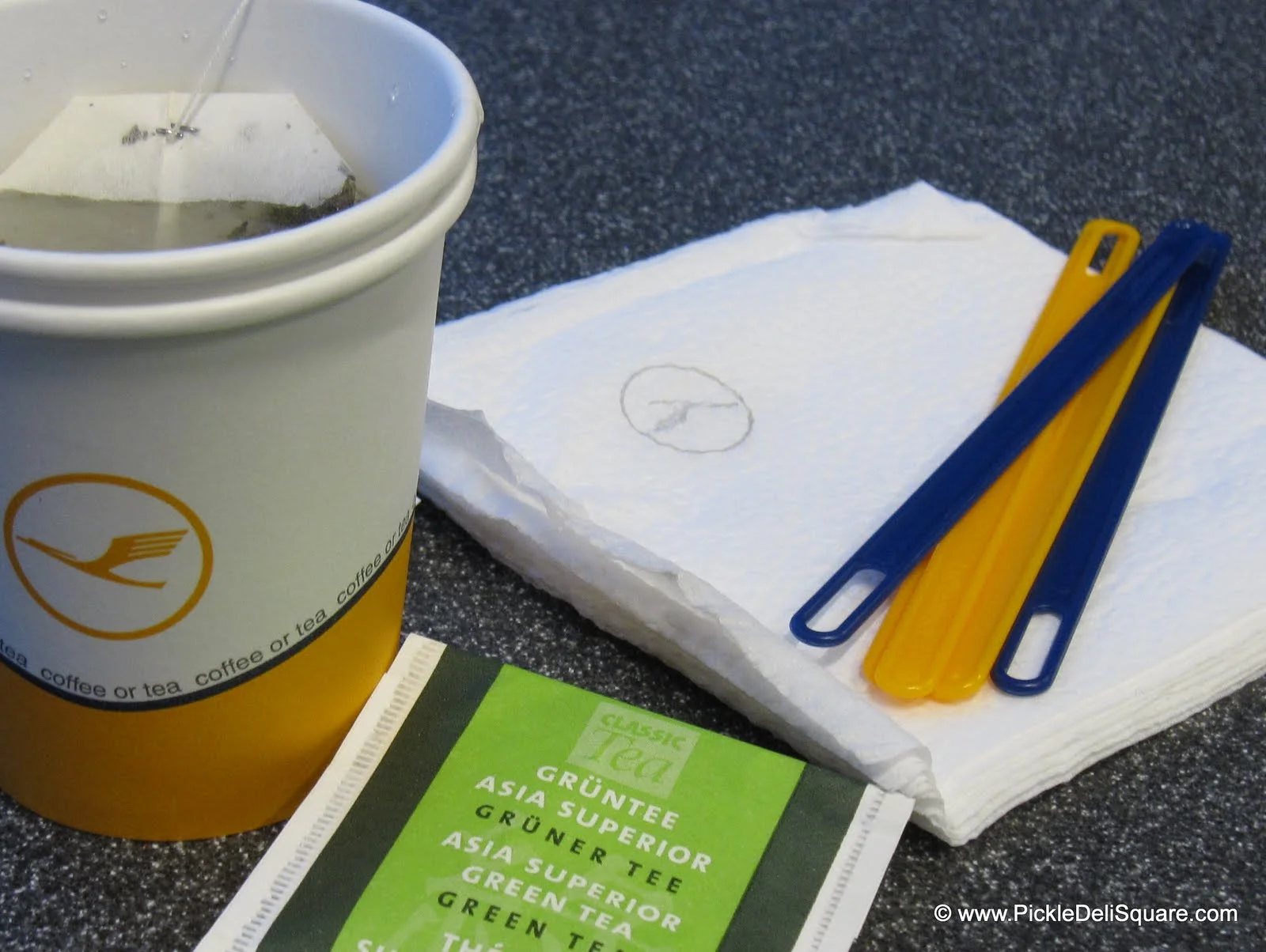
Even the stirrers share this machined rationality. It's functional too - the small cutout at the ends of the stirrers create more turbulence in the liquid you're stirring, enhancing the mixing.
And for the holidays, each aircraft bulkhead was decorated with this Christmas wreath. Sticking to ornamentation with only shades of grey - very Lufthansa.


